There’s been a fair amount of discussion about stock market analogs in the financial blogosphere and on social media over the past few months. Traders are basically asking themselves whether the current correction is just that or is, in fact, something more… like the start of a new bear market.
The most popular bullish analog I’ve seen compares the current stock market action to the 2011 correction. And based purely on correlation, the current correction fits very well with that earlier one:
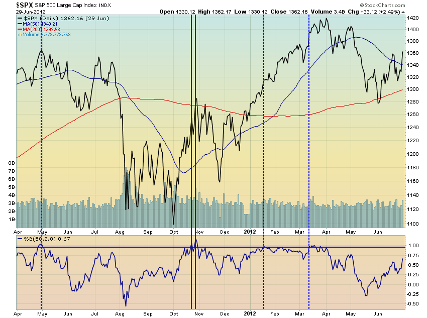
Still, there are major differences between today’s market and that one of four years ago. The most glaring of these is simply the earnings of the S&P 500. Back in 2011, the correction saw the index lose 22% from peak to trough. Earnings were also growing at a nice clip so the decline saw valuations dip to relatively depressed levels. At the lows, the p/e ratio on the index fell to 13 and change.
Today, in contrast, the peak to trough decline was only a bit more than half as deep as that earlier one was in percentage terms. Earnings are also declining today, rather than rising as they were back then. Finally the p/e ratio at the recent lows stood fully 45% higher than it did during the 2011 lows. So if investors are looking for another 100% gain over the next 36 months, as we saw after the 2011 correction, I think they’re misguided. The recent earnings trend and valuations now present major obstacles to this sort of outcome.
There are other problems with this analog including where we currently stand in the broader economic and credit cycles which will be made more apparent in looking at our next analog, which I’ve been following for some time now. I first learned of it when Ray Dalio presented it in a letter back in March of this year:
I keep coming back to Dalio's 1937 analog: http://t.co/UHrITpucuS 'History often rhymes.'
— Jesse Felder (@jessefelder) August 13, 2015
Interestingly, based simply on correlations the current market also fits very closely with that of 1937:
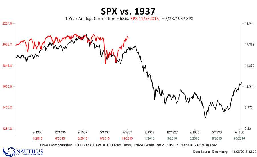
What makes this analog more compelling to me is the fundamental and historical comparisons Dalio makes between the two. And with the rising probability of a December rate hike, number 6 on the list is now possibly coming into clearer view.
- Debt limits reached at bubble top, causing the economy and markets to peak (1929 & 2007)
- Interest rates hit zero amid depression (1931 & 2008)
- Money printing starts, kicking off a beautiful deleveraging (1933 & 2009)
- The stock market and risky assets rally (1933-1936 & 2009-2014)
- The economy improves during a cyclical recovery (1933-1936 & 2009-2014)
- The central bank tightens, resulting in a self-reinforcing downturn (1937 & 2015?)
Now, I’m not saying (nor is Dalio, I believe) that the stock market is now going to crash because the current market is just like 1937. Effective use of analogs doesn’t rely on history repeating itself.
Investors who do so effectively, use analogs as just one tool among a myriad of others. And they do so in the belief that knowledge of market history is a great asset to an investors as history sometimes rhymes even if it doesn’t repeat.
Paul Tudor Jones famously used 1929 as an analog that helped him profit greatly from the 1987 crash. Less famously, Jim Rogers used 1937 as an analog to profit from that same event. And they both used these analogs merely as confirmation of a much broader trading process. And I’m certain Ray Dalio is now doing the same.
Ultimately, the 1937 analog looks much more compelling to me than the 2011 one because of all the supporting fundamental and economic similarities Dalio references. However, this is only one of many studies which tell me the risk/reward equation in owning the broad stock market is heavily skewed toward risk with very little in the way of reward.
Fact that bullish analogs are celebrated (11/98) and bearish analogs ridiculed (37/00) tells you all you need to know about sentiment.
— Jesse Felder (@jessefelder) November 16, 2015
Thanks to Nautilus Research for the analog charts presented above.